Bubble chart
The bubble chart is very useful to compare elements using up to four variables.
The following demo visualizes a comparison of OECD countries using four variables:
- Daily sugar intake
- Daily fat intake
- Obesity
- Safety fat/sugar intake
The color is used as a variable in this demo to show how each country is under the safe fat/sugar intake zone
Bar charts
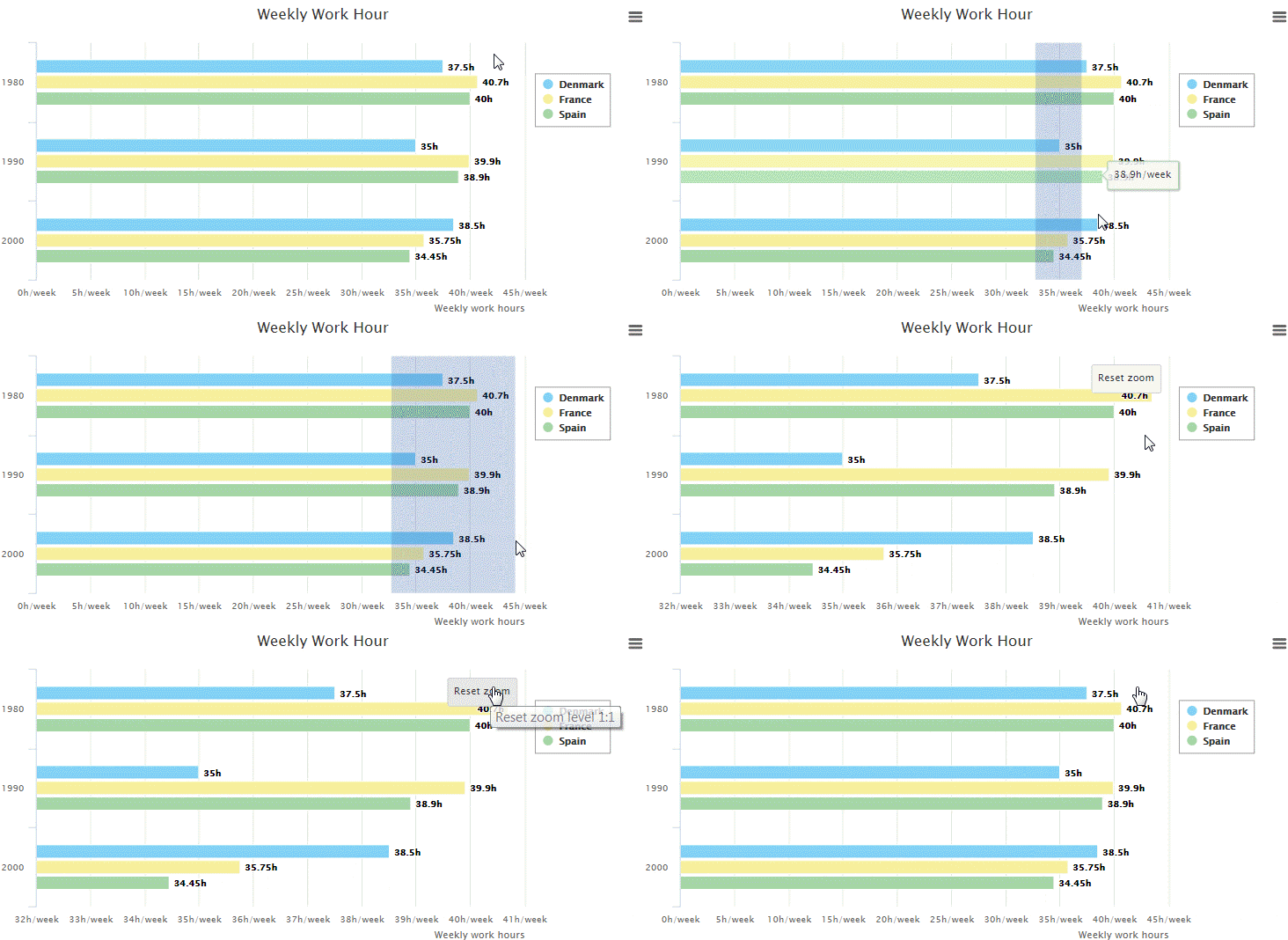
Bar charts are used to compare categories with discrete data.
The bars’ lengths are a good visual for comparison. According to the chart, in 2000, Denmark has the longest work hours per week, but in 1980 and 1990 it has the lowest working hours per week compare to France and Spain.
In a case of close data, feel free to provide an interactive zooming capability or/and a fix labels on each bar:

Column charts
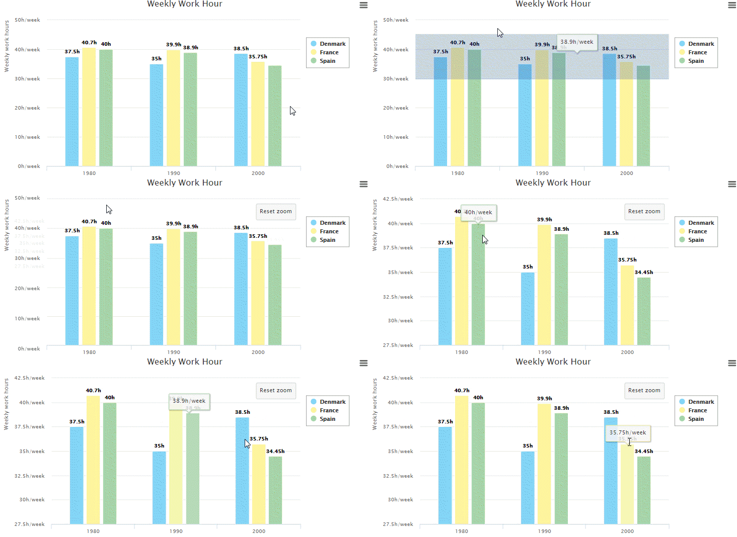
Column charts are used to compare categories with discrete data.
The columns’ lengths are a good visual for comparison. According to the chart, in 2000, Denmark has the longest work hours per week, but in 1980 and 1990 it has the lowest working hours per week compare to France and Spain.
In a case of close data, feel free to provide an interactive zooming capability or/and a fix labels on each bar:

Line charts
Line chart often used to compare series with continuous data.
The following demo allows us to see Asia has the biggest value over time, and also the biggest jump from 1900 to 2012.
Tree map
Tree map is a great choice for comparison, especially to show how big is the difference between categories, but also make the chart compact and without many distractions by removing axes, axes’ labels, and a legend.
In this demo, it is easy to see that Lebanon has the biggest number of refugees per capita, where Sweden has the smallest number of refugees per capita.